- Client
- Hayat Charity
- Project
- Brand identity and campaign visuals
- The name
- “Hayat” means life in Arabic
- Appeals
- Gaza, Yemen and Lebanon
The brief
Hayat Charity works in some of the hardest places in the world. Its name means “life”, and its new brand had to carry that warmth while looking as organised as any charity asking for people’s trust.
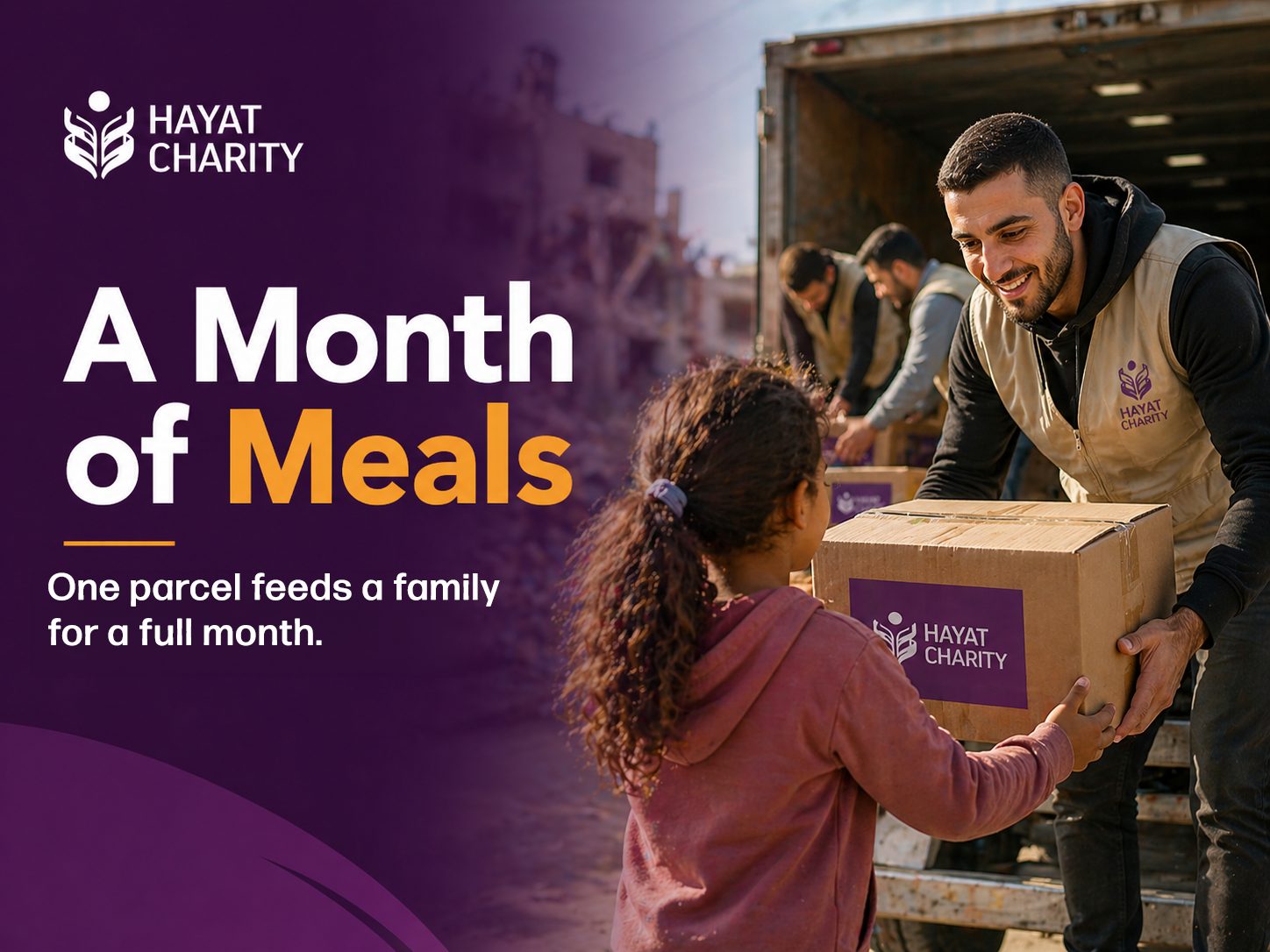
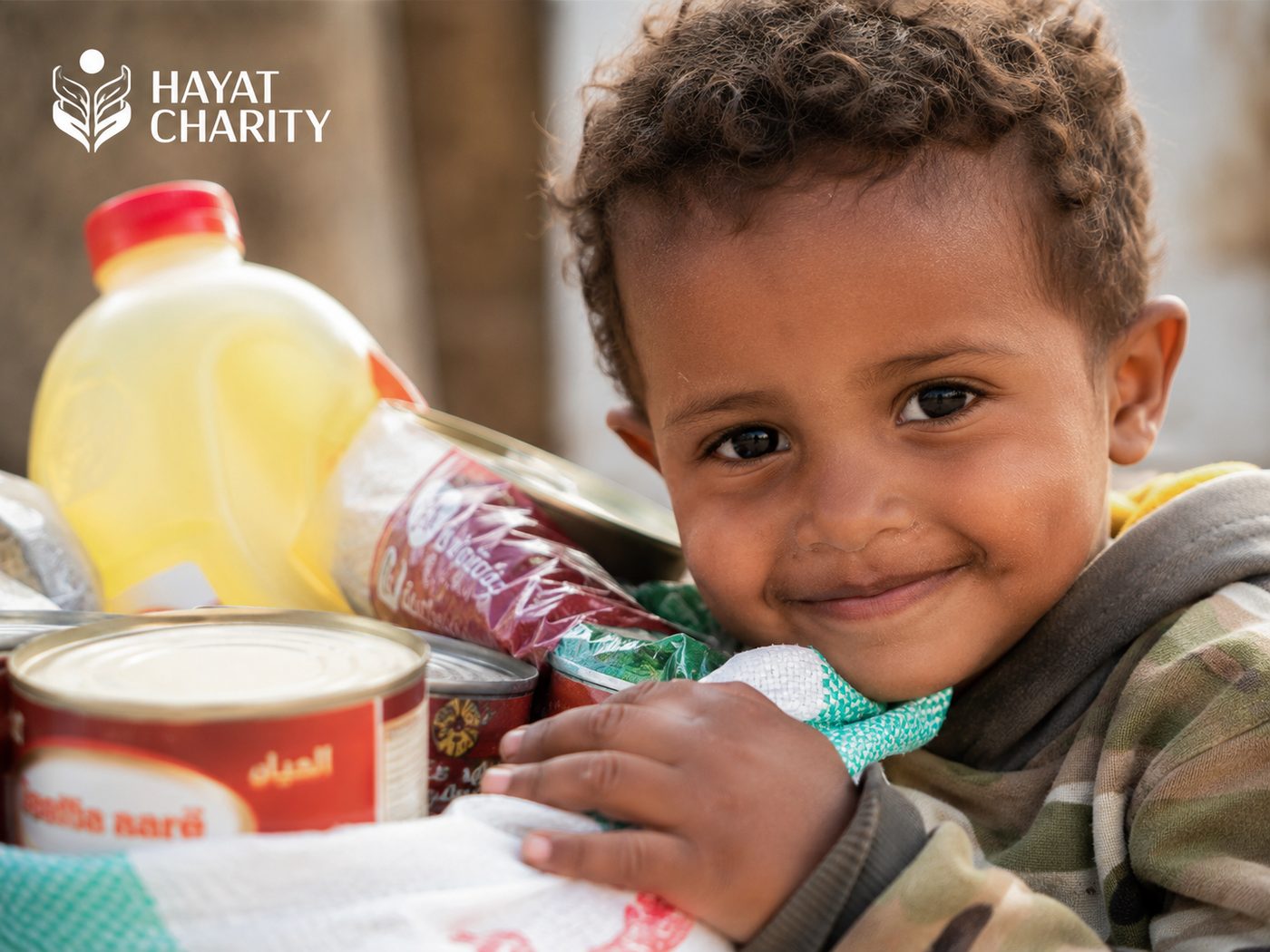
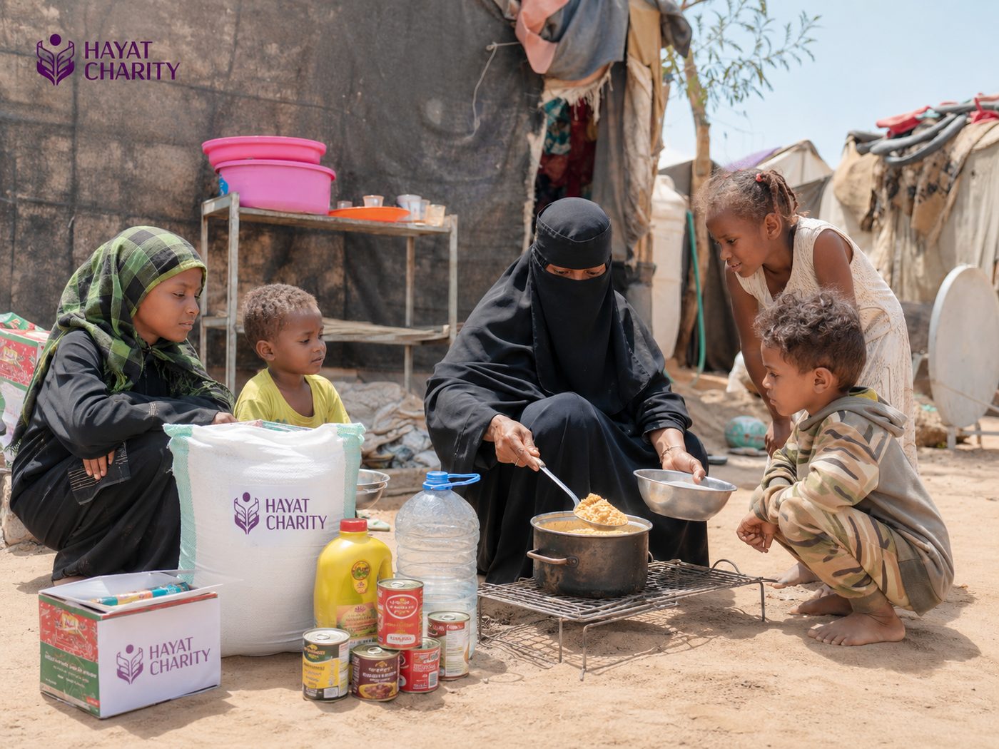
The mark is a figure rising from open hands, drawn as leaves around a single point of light. We set it in a deep plum with a warm orange, for light and dark backgrounds, and built a campaign look around it: real faces, warm light, one clear headline and the logo always in the same place.
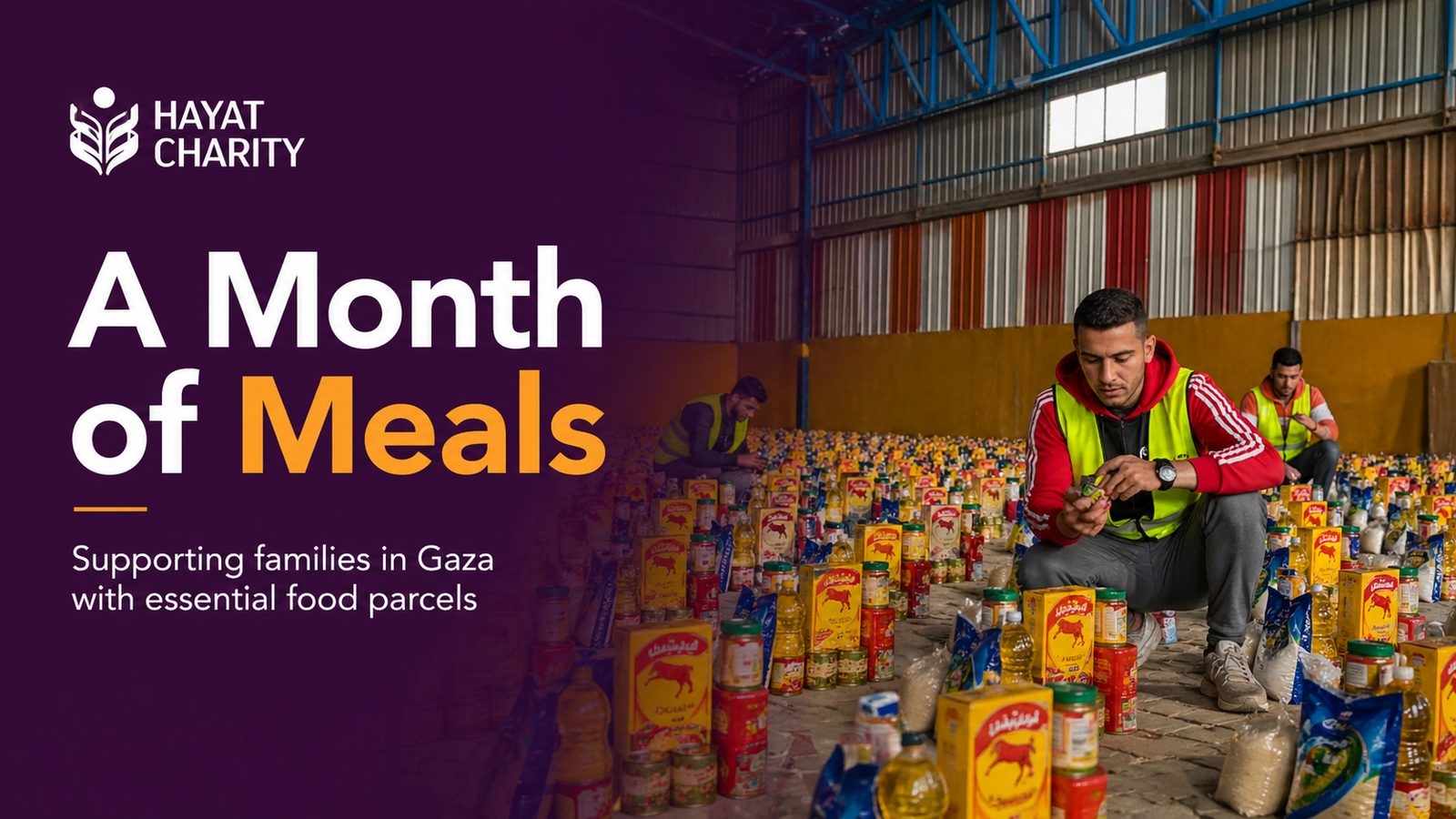
The same look runs through every appeal since: A Month of Meals for families in Gaza, A Month of Food for families in Yemen, and Frozen Qurbani in Lebanon.

What we did
Logo
A mark and wordmark in plum, white and orange, for light and dark backgrounds.
Colour and type
A deep plum with a warm orange accent, and one clear sans-serif.
Campaign look
One layout for key visuals: real people, warm light, one headline, the logo in the same place.
Appeal visuals
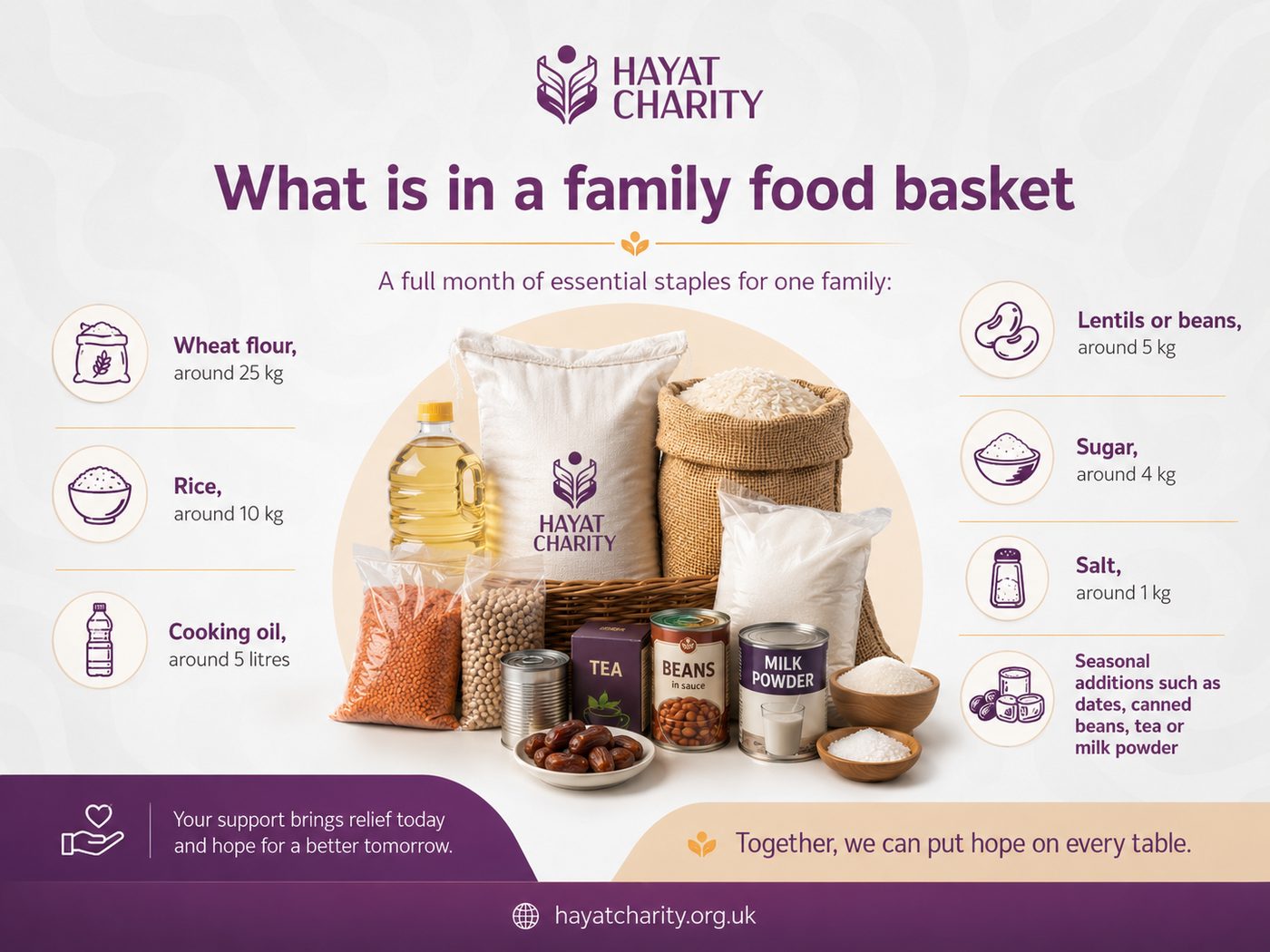
Key visuals and information graphics for appeals in Gaza, Yemen and Lebanon.
Related services

Next project · Hayat Charity
Frozen Qurbani: meat that lasts for months
See the case studyStart a project
Tell us about your next appeal.
Tell us the cause and the deadline. We’ll come back with a plan for how we’d raise for it.
© 2026 Andalus Media Ltd. Registered in England and Wales, company number 14028480. Privacy · Cookies · Terms · Accessibility · Sitemap