
- Client
- Amal Alumma Organization
- Project
- Brand identity and guidelines
- Languages
- Arabic and English
- Covers
- Logo, lockups, colour, type, pattern, applications
The brief
A relief organisation asks people to trust it with their giving. Amal Alumma needed an identity that felt hopeful and steady at the same time, and worked equally well in Arabic and English.
The mark starts from a single point that stands for initiative, the first spark of any good work. Four parts grow from it, one for each pillar of the organisation’s work: relief, protection, empowerment and health. Together they form a bright star, a ray of light for the communities it serves.
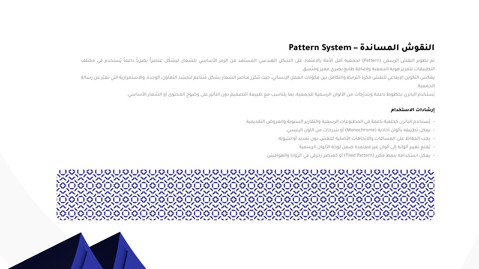
We set the mark in a deep royal blue, paired Tajawal for Arabic with Poppins for Latin text, drew a pattern from the mark, and wrote the guidelines that keep it consistent: bilingual lockups, clear space and minimum sizes, the palette and the common mistakes to avoid.




What we did
Logo concept
A mark built from the organisation’s values: initiative at the centre, four pillars around it.
Bilingual lockups
Vertical and horizontal versions in Arabic and English, with clear space and minimum sizes.
Colour and type
A royal blue palette, with Tajawal for Arabic and Poppins for Latin text.
Pattern and applications
A pattern drawn from the mark, applied to banners, outdoor and print.
Logo animation
An animated version of the mark for video and social media.
Guidelines
A guide to correct use and common mistakes, so the brand stays consistent.

Next project · Child Houses
A website for children in crisis
See the case studyStart a project
Tell us about your next appeal.
Tell us the cause and the deadline. We’ll come back with a plan for how we’d raise for it.
© 2026 Andalus Media Ltd. Registered in England and Wales, company number 14028480. Privacy · Cookies · Terms · Accessibility · Sitemap